When I was back east I checked in with the Rhode Island School of Design Alumni office. A fellow artist had recommended I speak with them regarding marketing. One of the main things that came out of the consult was my website (kindly designed years ago by friend Pat Tobin) was a bit out of date design-wise. After looking at it from the point of view of someone who has never seen my work I quickly realized there are things that need tweaking. The most glaring being how small and fleeting the homepage images are. Fine and fun if you know the work, but not if a total stranger is sending you the fifth email that day asking to be represented in your gallery.........
So this won't totally be design by committee, but rather is there stuff that people think I'm missing before I go ahead and re-do the whole thing?
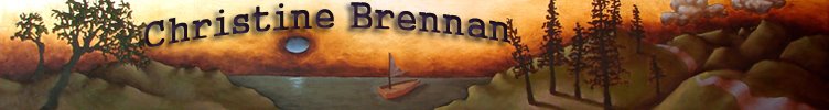
Images will be larger, and I'm told perhaps too many categories, but I do like my bird logo and I never get tired of those colors for some reason.
If you have any strong ideas leave them in the comment section. (And those few frustrated fans that don't seem to be able to leave comments I give up. I have checked and re-checked and this site is set up so that anyone google member or not should be able to leave a comment) Thanks everyone.


3 comments:
Definitely change the homepage!!! Otherwise, i like the straight-forward organization of the site.
I think go with what you want. It IS you anyway.....So go for it!
O.K. I have to be logged in to my google account to leave a comment.
Post a Comment